
Shown in this map is the distribution of food deserts in the continental United States between 2005 and 2007. Distribution is shown by percentage of households that were food insecure, or did not have access to grocery stores within 1 mile.

This map presents a comparison of average Body Mass Index with the presence of food deserts and with the highest concentration of single mothers with children under 18 in Chicago, Illinois. This map provides insight into some of the negative impacts related to living near food deserts, as well as the demographic being impacted.

Compared in this map are income, car ownership, obesity and diabetes rates. These maps show the correlation between health level and lack of access to fresh food in America.
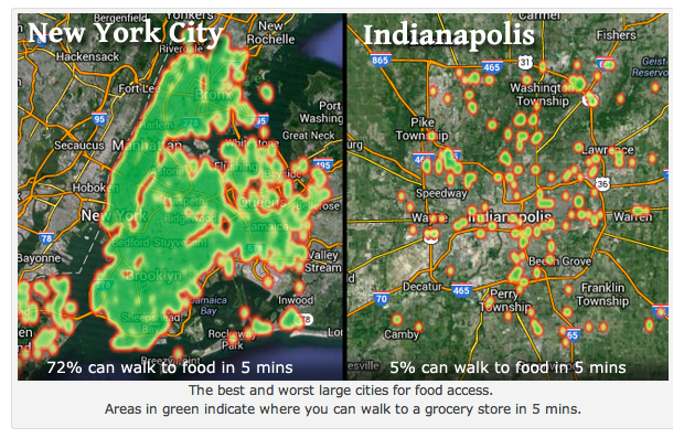
This map outlines the difference in food access in New York City vs. Indianapolis, both large cities. Green areas indicate where a person can walk 5 minutes to a grocery store. This shows that food access is not consistent, even in cities with larger population density.

Shown in this map is the general distribution of food insecurity in the United States. The darkest areas have the highest levels of food insecurity, while the lighter areas have the lowest.
:no_upscale()/cdn.vox-cdn.com/uploads/chorus_asset/file/13163499/fooddesertsmap.jpg)
This map shows an overlay of food deserts with ethnicity in Jefferson County in Birmingham, Alabama. This helps show the racial inequity correlated to the location of food deserts in Alabama.

Presented in this map is a comparison of food imbalance scores, grocery stores per square mile, and food deserts in Detroit, Michigan.
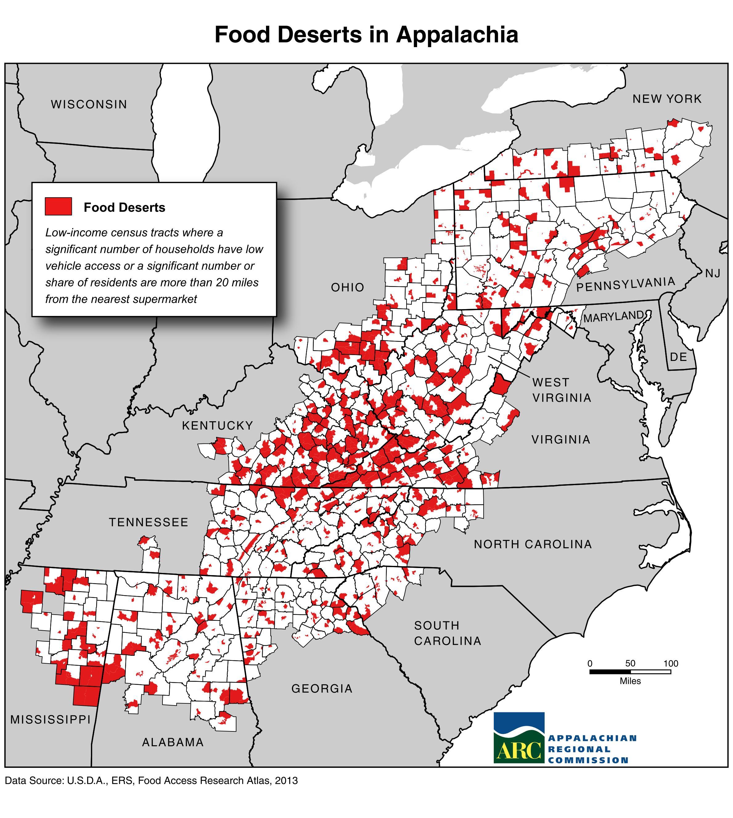
Shown in this map is the distribution of food deserts in Appalachia. This map defines food desert as a significant number of residents being more than 20 miles from the nearest supermarket with low vehicle access.

This map compares adult obesity rate by country with the presence of food deserts in the United States.
Produced by Delia Hill